
Workflow
The chosen zone system application workflow begins with a digital camera and ends with an inkjet printer.
Cameras
• Nikon D700
• Leaf Aptus-II 5 digital back on a Bronica ETRSi
Images taken in RAW format, 14-bit with the Nikon, 16-bit (14 effective) with the Leaf, at the native ISO’s of 200 and 25, respectively.
RAW processor
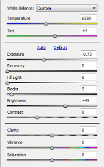
Adobe Camera Raw 6.3. The only controls used to vary the dynamic range of the images were Exposure (white point) and Blacks (black point). White Balance was adjusted with the eyedropper, and perspective controls were used to straighten the texture target images. All other settings were zeroed, including Brightness, Contrast, Sharpening, Noise Reduction, and Tone Curve. Images processed full-size at 300 ppi for printing, 16-bit, in the Adobe RGB color space.
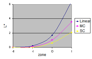
Why zero everything? The goal in this step is system characterization: determining the tonal limits of the system and how it responds to the available controls. Zeroed controls are not real-world settings, but they provide a fixed point of reference for comparison, and permit better measurement of what the system can do. Adjusting the Brightness and Contrast, for example, has a large effect on the shadow values, as illustrated on the right. My goal in testing is to see how much detail is really available for use at the shadow and highlight ends of the RAW image. I avoid sharpening and noise reduction in the testing workflow because I want to see the true noise and signal-to-noise ratios generated by the cameras’ sensors.
Note–the Adobe Camera Raw controls used here are the ones in process version 2010 (choose the process version on the Camera Calibration panel). As far as I can determine, the only ones that are adaptive, meaning that they adjust to the image, are Fill Light and Clarity. But according to Jeff Schewe in The Digital Negative, all of the tone controls in process 2012 (Photoshop CS6+, Lightroom 4+) are adaptive. (They have slightly different names and functions too: Exposure, Contrast, Highlights, Shadows, Whites, and Blacks.) See Process 2012 for details. So even if you use process 2012 in real life, do not use it for system calibration, because the adjustments are not constant between images. (This also goes for images intended to be stitched into a panorama.)
Having characterized the system, the next step is calibration using more realistic settings, which will be discussed later.
Photo editor
Adobe Photoshop CS5. Images printed at 300 ppi in the Adobe RGB color space.
Printers
Hewlett-Packard DesignJet 130 RIP, using HP Premium Plus satin photo paper.
Canon imagePROGRAF iPF6350 using Ilford Galerie Gold Fibre Silk paper.
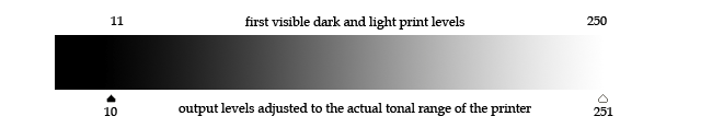
Color management is essential to any print workflow. The last step in profiling a printer, which is often overlooked, is the determination of the printer’s actual tonal range, using a test image like the one at the right. (The thumbnail is a link to the .tif file.) Until this is done, zone system calibration will be a frustrating experience, as determining the shadow and highlight thresholds will be a trial-and-error process.
To determine the printer’s tonal range, print the test image using the appropriate printer profile. The image consists of a series of dark squares on a black background, and light squares on a white background. The RGB levels of the dark squares run from 1 to 20, and the light squares from 254-235. Let the print dry, then examine it in a good light, no brighter than the conditions under which your prints are likely to be viewed. It should be fairly easy to identify the first visible light square, but the first visible dark square may be something of a judgment call. Many photographers act as though Dmax were sacred, and may recoil at the thought of printing at a level above the printer’s maximum black; but if you can’t see the difference between the darkest levels in a print, you have lost part of your image. Choose the first dark square that you can really see. The tonal range of the printer runs from the level darker than the first visible dark square, to the level lighter than the first visible light square. Before printing any image, apply a Levels adjustment layer, and set the output levels to the printer’s tonal range. (Tip: save this as an action.)

One more step remains before setting out on zone system calibration. Having determined the printer’s output levels, print another test image, this time to choose the threshold shadow and highlight levels (zones I and IX in the traditional system). The image at the right is similar to the previous test image, but uses L* (0-100) rather than RGB (0-255) levels. I chose 2 and 98 as my shadow and highlight thresholds.
Why L*a*b*?
Why measure L* (lightness) if we are not using the L*a*b* color space? L*a*b* is a standard for measurement; it is intended to be perceptually uniform, and the values are independent of the working color space, such as Adobe RGB or ProPhoto RGB. In the images below, the black, gray, and white patches have the same L* values. If you have a color-managed browser, you will see that they have the same appearance, but different B (as in HSB) values, in different color profiles.
| L*a*b* | 2 | 50 | 98 |
| Adobe RGB |

|
||
| B | 6 | 46 | 98 | ProPhoto RGB |

|
| B | 4 | 39 | 97 |
If your browser is not color-managed, such as Opera or Chrome, the sets of patches, especially the grays, will look a little different. Try Firefox, IE, or Safari; or save the images and open them in a color-managed application such as Photoshop.
p.s. I write it L*a*b* to emphasize that the letters are to be pronounced separately, like RGB or CMYK. L*a*b* has nothing to do with a laboratory, or a Labrador retriever!
Next: the exposure series