— Ansel Adams, The Negative (1948, 14)
Beyond the Digital Zone System
 Zone system myths
I am going to start by discussing some zone system myths, because until they are swept away, it may be hard to wrap one’s mind around the idea of using the zone system with anything other than black-and-white negatives. So, here goes . . . .
Myth #1: The zone system divides the image scale into ten zones.
The reality is that it is the exposure scale of the subject that has zones, not the image; and that the zone system itself does not specify any number of zones, because the range of zones represented in the image depends on the photographic medium in use.
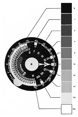
|
| The Gray Scale and the Weston Meter Dial. — Ansel Adams, The Negative (1948, 14) |
This myth is very deeply embedded in the collective photographic consciousness, and it is not hard to see why. In the 1948 edition of The Negative, Ansel started his discussion of the zone system with an illustration of a ten-step gray scale of print values next to a Weston meter dial that was marked off in Roman zone numerals, and back then he called those values Print Zones. It would have been natural to conclude that a specific scale of print values is the basis of the zone system. But the system was still in development in 1948; and by 1981, he had more logically defined the relationship between zones and values:
So exposure zones come first, and print values follow. As you can see from the description above, zones are actually exposure values, assigned Roman numerals centered on V for the exposure indicated by a light meter.1
But even the 1981 edition of The Negative contains a number of illustrations of gray scales, and they all have the legendary ten (actually eleven, from O to X inclusive) zones. Why ten zones? In 1948, Ansel’s explanation was a little mundane:
A more realistic basis for ten zones is found in the 1981 edition. Speaking of a film’s characteristic curve:
In other words, black-and-white negatives tend to have about a ten-stop range from threshold shadow exposure to loss of highlight detail. But black-and-white negatives are not the only photographic medium. How did Ansel apply the zone system to reversal materials (transparencies and Polaroid images)?
Minor White illustrates this in his book, The New Zone System Manual; his example of a “zone ruler” constructed from Polaroid prints extends from zones II to VIII (seven zones, not ten):
| II | III | IV | V | VI | VII | VIII |
So, ten zones are logical when working with black-and-white negatives, but not necessarily any other medium. And trying to arbitrarily fit other media into the ten-zone mold is not likely to be successful. For example, to preview what is to come, placing what is intended to be a textured highlight onto zone VIII when using a digital camera will probably result in disappointment, because many digital cameras saturate to pure white by zone VIII.
One last note: the development of black-and-white films can be altered to produce negatives with expanded or contracted range; under these conditions, the number of zones recorded in the image may vary from perhaps 8 to 12.
So, to correctly restate the myth above (emphasis on the corrections):
The zone system, when applied to conventional black-and-white negatives, divides the exposure scale of the subject into about ten zones.
Table 2 gives the approximate values for various types of subjects
rendered “realistically.”
Table 2. Description of Zones.
| Value Range | Zone | Description |
| Low Values | Zone 0 | Total black in print. No useful density in the negative other than filmbase-plus-fog. |
| Zone I | Effective threshold. First step above com- plete black in print, with slight tonality but no texture. |
|
| Zone II | First suggestion of texture. Deep tonalities, representing the darkest part of the image in which some detail is required. |
|
| Zone III | Average dark materials and low values show- ing adequate texture. |
|
| Middle Values | Zone IV | Average dark foliage, dark stone, or land- scape shadow. Normal shadow value for Caucasian skin portraits in sunlight. |
| Zone V | Middle gray (18% reflectance). Clear north sky as rendered by panchromatic film, dark skin, gray stone, average weathered wood. |
|
| Zone VI | Average Caucasian skin value in sunlight, diffuse skylight or artificial light. Light stone, shadows on snow in sunlit landscapes, clear north sky on panchromatic film with light blue filter. |
|
| High Values | Zone VII | Very light skin, light gray objects; average snow with acute side lighting. |
| Zone VIII | Whites with texture and delicate values; tex- tured snow; highlights on Caucasian skin. |
|
| Zone IX | White without texture approaching pure white, thus comparable to Zone I in its slight tonality without true texture. Snow in flat sun- light. With small-format negatives printed with condenser enlarger, Zone IX may print as pure white not distinguishable from Zone X. |
|
| Zone X | Pure white of the printing paper base; specu- lar glare or light sources in the picture area. |
— Ansel Adams, The Negative (1981, 59-60)
Myth #2: This (referring to the table on the right, or a derivative thereof) is the zone system, and these are definitions of the zones.
First, note that these are descriptions of zones, not definitions. And, not to belabor the point, this table was published in a book called The Negative.
Anyone who professes to understand the zone system should first, in my humble opinion, read chapter 9 of Ansel’s book, Polaroid Land Photography. Even if one has no interest in this (hopefully not dying) art, the book should be considered the fourth one in the photography series for a number of reasons. In chapter 9, “Exposure and the Zone System,” Ansel applies the latter specifically to Polaroid materials, step-by-step, and compares the results with the familiar ones known from black-and-white negatives. This is an invaluable source of information from which to glean the basic principles of the zone system, independent of the photographic medium in use. Figure 9-7 below should be an eye-opening experience to anyone who has so far only understood the zone system as applied to black-and-white negatives.
Ansel then points out that many Polaroid materials actually have a much smaller dynamic range than that illustrated in the figure.
Along the same lines, from The New Zone System Manual by Minor White:
So, to correct myth #2: the table on the right is not the zone system; it is the result of applying the zone system to conventional black-and-white negatives.
The full black-to-white Polaroid scales usually span an exposure range of 1:16 to 1:48, Zones II-III to VII-VIII½. With conventional negatives the effective exposure range is 1:128 or 1:256, Zones I through VIII or IX. Only Value V remains constant throughout, and we visualize the other values in reference to the exposure scale of the film in use. Print Values IV, V, and VI will be quite similar with Polaroid or conventional materials, but Value III in a Polaroid print is not the same gray value as in a conventional print. In visualizing the values of the Polaroid print you must adjust to its restricted range, which is comparable to that of color transparency materials. Through experience you can learn what Zone III represents in a conventional film and in Polaroid print films, and visualize results appropriately in reference to the material (see Figure 9–7).
| Relative luminance units |
Conventional Black-and-White Film |
Polaroid Black-and-White Prints (Approximate) |
|||
| Exposure zone |
Print value |
Description | Print value |
Description | |
| ½ | 0 | 0 | Solid black | 0 | Solid black |
| 1 | I | I | First step above solid black |
I | Solid black |
| 2 | II | II | First “texture” | II | First step above solid black |
| 4 | III | III | Textural significance | III | First “texture” |
| 8 | IV | IV | Average shadow value |
IV | Average shadow value |
| 16 | V | V | Middle gray—18% gray card value |
V | Middle gray—18% gray card value |
| 32 | VI | VI | Average skin reflectance (36%) |
VI | Average skin reflectance (36%) |
| VI½ | High skin value | ||||
| 64 | VII | VII | High skin value, full texture |
VII | Quite high value— reduced texture |
| VII½ | Usual texture limit | ||||
| 128 | VIII | VIII | Highest textural value |
VIII | Just below pure white |
| VIII½ | Pure white | ||||
| 256 | IX | IX | Untextured white | IX | Pure white |
Figure 9–7. Relationship of Exposure Zones and Print Values
— Ansel Adams, Polaroid Land Photography (1978, 129-130); highlight colors added
Myth #3: The zone system requires variable processing of the negative, and therefore cannot be applied to other media.
We have pretty much exploded this one already. Some more quotes:
Myth #4: The zone system cannot be applied to advanced imaging techniques such as High Dynamic Range (HDR) imaging.
The zone system is ideally suited for HDR imaging. See the More Examples page for two HDR images captured using the zone system.
Side note: is the zone system a part of the printing process?
The zone system itself is mentioned exactly twice in Ansel’s book, The Print (1983): on page 2, where he is summarizing the photographic process described so far in The Camera and The Negative; and in a caption on page 113, where he points out that he made that negative before the zone system had been formulated. The captions of nine of the photographs reproduced in the book mention zone placements made when the photographs were taken. And, in a total of five places, Ansel refers briefly to print values while describing various photographic processes. On page 20, he gives approximate negative densities for diffusion and condenser enlargers, for values I, V, and VIII. In the text and a caption on page 32, he recommends performing a safelight test with a paper exposed to about value VII. On page 79, he says to inspect the textured high values, VII-VIII, after making a test print. (Remember, he was printing from black-and-white negatives.) On page 119, he warns about mottling in values V-VI while using water-bath development. And on page 183, he says he sometimes notes a jump in the value scale around IV-VI in gravure reproductions. (He also refers to equipment from Zone VI studios several times.)
What he never does is describe the making of any print in terms of fixing image elements on any specified value (or zone). What he actually refers to are qualities such as brilliance, texture, luminosity, the separation of values, and logical relationships.
For example, in printing Interior of Church, Mendocino, California:
I will assert that the zone system is primarily an exposure technique that is used during image capture to ensure that all visualized subject elements are recorded in the image. During the printing process, whether in the wet darkroom or in Photoshop, dodging, burning, contrast adjustment, and so forth are used to create the final product based on how image elements look in relation to the rest of the print, not where they fall on a predetermined value scale. This is what Ansel meant by saying that the negative is the score, and the print is the performance.
Next: a working definition