An Introduction to Photo Editing with PhotoLine: Black/White Conversion, Channel Mixing, and Toning
The easy ways
The brute force way to convert a color image to black-and-white is to change its mode to grayscale. It is quick and easy but the result is seldom spectacular. Use Layer – Convert Layer Type – Gray Image, or on the Layer properties panel, select Type: Gray.
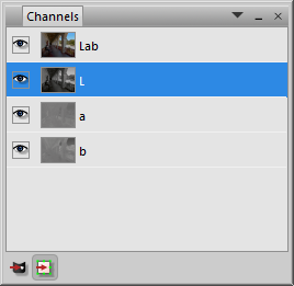
A slightly better way is to use the L channel. An image’s channels are based on the background layer. Convert the image (i.e. the background layer) to Lab via Layer – Convert Layer Type – Lab Image; or on the Layer properties panel, select Type: Lab. Now on the channels panel, select the L channel. Clicking the Channel to Layer button at the bottom of the panel creates a new grayscale layer that is a copy of the L channel. The image does not have to remain in Lab mode; you can go to the Layers panel and convert it back to RGB. Or to preserve the original RGB image untouched, acquire the L channel from a copy of the image (Edit – Merged Copy; Edit – Paste as Document).
|
|
The old-fashioned Channel Mixer
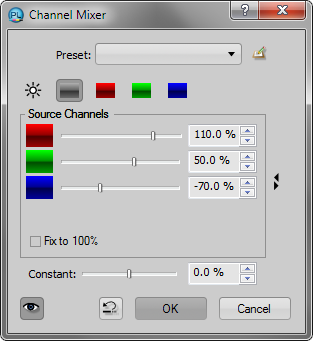
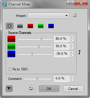
The Channel Mixer is a world of its own. It is usually thought of as a way to convert a color image to b/w, but it has other subtle uses. It lets you mix different proportions of the image’s channels and display the result in either b/w or color. Apply it via Layer – New Adjustment Layer – Channel Mixer. It can be used in three different modes:
1. For b/w conversion, use Gray Image mode (the gray gradient icon). By default, you are looking at the red channel. Set green or blue to 100% and the others to 0% to see the other channels. Fix to 100% preserves the sum of all the channels (there is no law that says you have to do this).
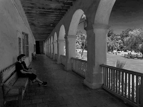
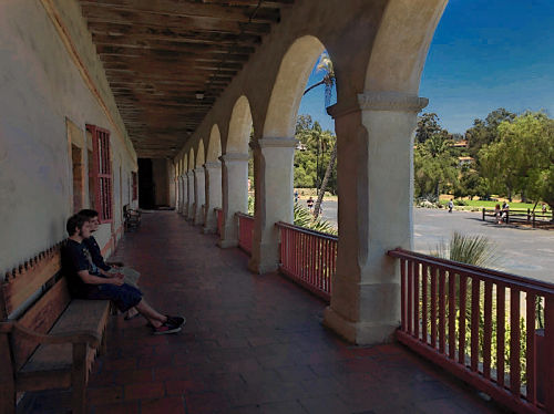
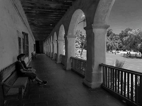
For example, the red channel looks like a b/w photograph taken with a red filter, with dark skies and foliage. Mixing in the green channel tones down the effect, more like a yellow filter. Note that the numbers can be negative; subtracting the blue channel and raising the others can produce hyper-real dark sky, light foliage effects. (Note that extreme edits have exceeded the limits of our compressed 8-bit JPEG image, resulting in banding in the sky and other artifacts; this is why we edit in 16-bit and a wide gamut if at all possible. After the edits are finished, converting to 8-bit for display has little effect; it is the pushing and pulling on the color numbers during editing that requires 16-bit.)
 |
 |
2. To enhance a color image, the Channel Mixer may be used in Luminance mode (the light source icon). This uses the channel-mixed grayscale image as a virtual L channel. The effects can range from subtle to surreal and be hard to control.
 |
 |
3. The Channel Mixer may be used on the color channels of a color image to adjust hue and value relationships. For realistic images, the desired adjustments are probably small. For example, subtracting a little red from the blue channel can cool the sky and lighten foliage. Use Fix to 100% in this mode.
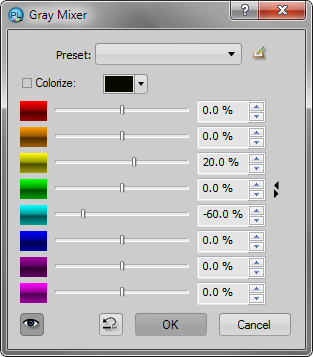
The newfangled Gray Mixer
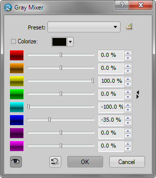
The Gray Mixer (also known as a Black & White adjustment) lightens and darkens selected hue ranges in the image. It is easier to control than the Channel Mixer, and tends to produce more naturalistic effects. By default, it produces a grayscale image. This is probably the easiest way to make a high-quality b/w image. Apply it via Layer – New Adjustment Layer – Gray Mixer.
 |
 |
If you set the layer blend mode to Luminance, you can adjust a color image as with the channel mixer above, darkening the skies and so forth.
 |
 |
Colorize
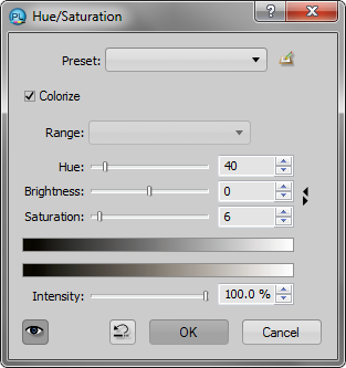
Colorize adds color to a b/w image, like a toned photograph or a duotone (better than a duotone in my opinion if all you want is one color). There are other ways to do it but I think this is the best. Apply it via Layer – New Adjustment Layer – Hue/Saturation, and click Colorize. For best results, set the blend mode to Color in the Layers panel. Set the Hue (starting points are around 20 for selenium, 40 for sepia, 80 for Ektalure green, 210 for cyanotype) and Saturation (very low numbers for warm, cold, or tinted blacks, higher numbers for full toning). Keep your hands off the Brightness slider, the effect is awful. Note that the hue is affected by the image’s color profile; the numbers will need to be different in ProPhoto, for example, than in sRGB.
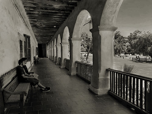
You can use Colorize to convert a color image to b/w, but it is best to convert it using one of the methods above and edit it first, making sure that it ends up in RGB mode; colorize should be performed last. The image below had a number of adjustments made to it after b/w conversion. (Just f.y.i., the yellowish coffee-colored sepia is obtainable in the darkroom by using a warm-tone paper and ferricyanide bleach made with potassium iodide, followed by sulfide toning.)
 |
 |
Split toning and tritone/quadtone effects may be achieved by applying color filters to one or multiple layers as previously described. Start with a grayscale image and make a stamped copy layer (Edit – Merged Copy, Edit – Paste as Layer). Colorize the copy layer (and maybe the background too), right-click the layer on the Layers panel, select Color Filter, then adjust the blend range. (You can also apply a blend range to a Hue/Saturation layer).
Miscellaneous concepts
After b/w conversion, more adjustments are likely to be needed. A b/w image speaks a different language from that of a color one; aspects such as form, contrast, and texture become more important because there are no color differences to convey the information.
Note that adjustments may be made to a color image prior to b/w conversion in order to affect its appearance afterward, such as changing the lightness of certain colors. This can even be done after conversion; make the adjustments to a color copy of the original, then superimpose it on the b/w image using Luminance mode.
After making a magnificent b/w image, it may be tempting to see what it looks like as the L channel combined with the original color. In my experience, this rarely works; the colors may no longer look right; and the adjustments that look good in b/w may be distracting or simply overwhelming when combined with color. The ingredients need balance.
Always capture your images in color, even if you consider yourself a black-and-white photographer; the control that you have over the conversion process greatly exceeds anything that you can do with a b/w capture. Using color filters that are intended for b/w photography during capture can make things worse; a red filter, for example, effectively turns off the green and blue sensors in your camera, and you might as well consider it to have only 1/3 of its native resolution. (Color correction filters, such as for use under fluorescent lights, are a different matter.) Converting the image after capture makes use of information from all the sensor elements, improving the overall response and reducing noise.
Next: HDR imaging
